
Each morning when we wake, we open our eyes. At first blurred, everything may appear a little fuzzy, but quickly our eyes begin to orient us to our surroundings. Shapes and colors begin to come into focus and, while we still may not see the entire picture, our brain begins to fill in the missing pieces – creating shapes and jogging memories that help piece together that entire picture.
Our sense of sight is powerful and the amount of data we process continues to increase dramatically. This is why data visualization is becoming so useful and desirable in fields such as academia, social sciences, and industry. Add in the need to make fast, quality, data-driven decisions based on the incredible amount of data being generated every day, the importance of any visualization you create becomes more critical than the data itself.
Why Data Visualization?
Data visualization is a powerful form of business communication used across departments within an enterprise in the form of status reports, departmental dashboards and enterprise-wide balanced scorecards. When data is presented in a pictorial or graphical format, it allows people to see things that may not have been obvious when viewing the raw data and most likely took much less time. Patterns and trends can be spotted easily and communicated quickly. Two of the most important benefits of data visualization are interpretation and communication.
Interpretation
Data visualization allows us to interpret enormous quantities of data. For example, the following table is a raw data dump showing the stats of NFL quarterbacks. By looking at this data, can you tell me which quarterback had the most touchdowns and interceptions?
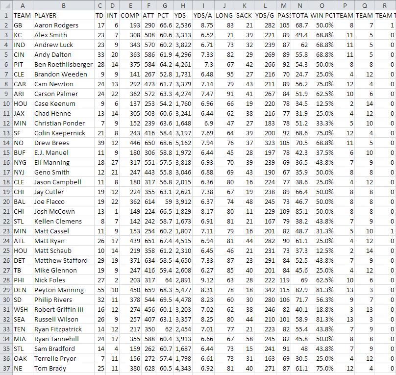
While you may have been able to answer the above question, it probably wasn’t without some effort and a little bit of time. Now take a look at the graphic below which is a visual display of the same data. The X-axis is passer rating; the Y axis is interceptions, and the size of each circle equals the number of touchdowns.

Viewing the data this way makes it easy to answer the question. It also opens up the possibility to answer additional questions such as how does the QB Rating, the number of touchdowns, or the number of interceptions impact the teams overall win-loss performance?
Selecting the proper data visualization will allow your audience to easily and quickly interpret the data. As you can see in the visualization above, by using color and size of the circles, you now have 2 additional dimensions of data in addition to the x- and y-axis.
Communication
Another benefit that data visualization provides us with is the capacity to make decisions based on certain trends or patterns. As is true with any business communication, written or graphical, it’s important to make sure you present data visualizations that are both contextually accurate and are properly summarizing the situation and doing so at a level of detail that is appropriate to your audience. Contrary to what we were all taught in school, no one wants to ‘see your work’ so leave the data in their data stores. Take the above example – with the above visualization we can quickly understand who not to play next week in our fantasy football league (kidding, but only partially). What these numbers could not communicate when presented as text in a table, which our brains interpret through the use of verbal processing, becomes visible and understandable when communicated visually. This is the power of data visualization.
Plan Ahead
Data visualization encodes information in a manner that our eyes can discern and our brains can understand. As the saying goes “A picture is worth a thousand words” – you can stare at numbers in a spreadsheet all day and never see what becomes immediately obvious when you look at a pictorial or graphical representation of these same numbers. But if the picture is not meaningful because it lacks the proper context or does not summarize the data with the correct level of detail for the audience, the ‘thousand words’ may only end up being ’one hundred words’ or worse. And if the decisions being informed by the data end up incorrect or not being made at all, the outcome for the organization could be severely impacted. To help us avoid this, consider the following guidelines to create the most effective visualizations.
- Always start with the end in mind. Identifying what decisions need to be informed by the data.
- Determine what context is required to ensure proper interpretation. Context includes time, geo-location or economic factors, to name a few.
- Know our audience. Are you presenting to executives, mid-level managers or operations teams? Answering this will drive the level of detail available in a presentation or a report. In most cases the level of detail will be different based on who’s in the audience.
Once the data visualization is complete, take some time to consider if your visualizations tell the story it should be telling. There are many new tools and visualizations available such as spark charts and tree maps that look ‘sexy’ and ‘cool’ and in many cases are very powerful options to consider. But remember, if your story can be told quickly and efficiently with a simple x-y chart, then use a simple x-y chart.
Posted by Stephanie Mandra and Ric Leeds